BRAND MARKS AND LOGOS
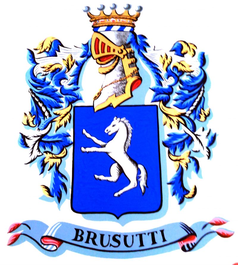

Brusutti Corporate Logo
The 1940s logo features a crest framed by two wings, symbolizing the company’s transportation activity. At the center stands a lion, evoking the geographic identity of the firm as the first passenger-transport company in Venice (the commercial use of the lion is extremely rare; typically, only the Municipality may employ it. Exceptions were made for historic companies originating in the Savoy period). The colors—blue and gold—echo the wealth of the sea and the chromatic tradition of La Serenissima.

BRUSUTTI FOUNDATIONSCIENTIFIC LOGO
Green in color to reflect the Foundation’s social mission, the logo represents an egg-shaped cell with an embryonic nucleus positioned very close to the cell’s perimeter. A lighter area symbolizes fragility and the need for timely intervention so the nucleus does not disperse. The Scientific Committee’s role is to propose targeted actions that promote social well-being, which are then submitted to the Foundation’s members in the interest of society at large.
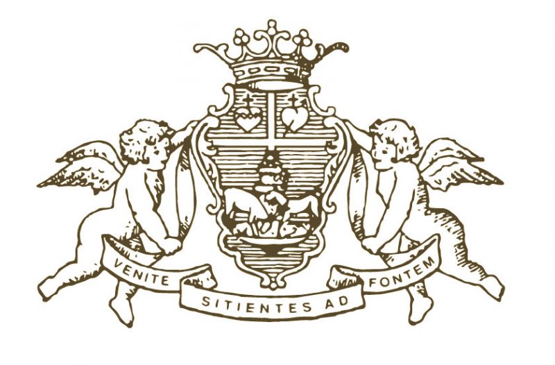
BRUSUTTI FOUNDATION CREST
The Foundation’s presidential coat of arms is supported by two angels lifting a shield bearing a motto. This shield and motto derive from the coat of arms of an ecclesiastical member of the Brusutti family. The emblem depicts two deer drinking from a spring—imagery suggested by the Bishop of Treviso, Antonio Mistrorigo—recalling the passage from the prophet Isaiah: “Venite sitientes ad fontem” (“Come, all you who thirst, to the water”). Christian origins, and above all the message drawn from the Gospel, form the basis of the Foundation’s mission. Two hearts symbolize social closeness; a horse evokes the family’s name and history.